
So, I thought it might be fun to post the itty bitty covers that caught my eye. As an author, I'm always looking for ways to improve my books and my covers are important to me. Sometimes, they inspire me to write faster so I can share them with you guys and sometimes, I want to blow them up to poster size and paint my walls with them :) I'm sure these authors are no exception.
I may even throw in a cover or two that makes me laugh or cringe for fun.
So here goes.
Love the colors in this one,. It drew me in immediately. I've also heard this is a great series, so I will be investigating!

Although the title is hard to read, I like the softness to this cover. I can barely make out the word Fae, but that is enough for me to check it out, lol.
This one almost didn't make it. The colors are too muted for my tastes and the title is really hard to read, but I wanted to know what was in the distance. I think this would have been better if the background had more contrast, but that's just me. It still does the job of pulling me in.

I did a double take on this one. I love the mystery and the look in the girl's eyes. Yes I hosted a cover reveal for this title, but I would still be drawn to it just by thumbnail.

Look at this little bitty gem. It makes me cold at just a glance. The title is easy to read and the colors set a mood. Does the blurb match that mood?
The title could be bolder or a different color in my opinion on this, but the composition is excellent. It makes me wonder if that is a braid on her back or something else. The mood is also mysterious, which I like.
Now for the humor. Tell me it doesn't look like that bat is stabbing the poor girl in the eye (Can you tell it is a bat?). Also in a slightly larger version it looks like she has a horn growing out of her head. It's funny how things look so much different when it doesn't take up the majority of the computer screen. Even so, I looked at the book :)
And the winner this week is...
I really couldn't pick just one, so here are my favorites for this week? Do you agree?
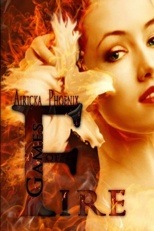
Who knew there was a Games in that title. Hmm.
I keep my original opinion. The title should be a different color, lighter, but it is still a great cover. Look, that isn't a braid down her back. What is it? LOL

So there you go. What covers have captured you lately? What draws you to covers? Are they important for you as a reader?
Until next time...
No comments:
Post a Comment